a.lau.c Illustrations
  • Home
  • Contact
  • University
    • Year 1 >
      • Semester 1 >
        • Art history
        • Introducing visual communication >
          • The comic
          • Technical skills
          • Drawing and visualising
          • Colour, composition, and linear narrative
      • Semester 2 & 3 >
        • Multi-dimensional Illustration >
          • 2D
          • 3D
          • 4D
        • Visual problem solving >
          • DIY alphabet
          • Type talk
          • Mini briefs
    • year 2 >
      • semester 1 >
        • Drawing >
          • Life Drawing
        • Illustrators toolkit
      • Semester 2 >
        • The Critical Illustrator
        • Illustration Projects >
          • Conceptual Editorial Illustration
          • Literal Illustration
          • Children's Book
          • Protest Pack
          • Anne Magill
    • Year 3 >
      • semester 1 >
        • Advanced Illustration >
          • Stamps
          • Book Jackets
          • Self Authorship
      • Semester 2 >
        • Final Major Project >
          • A Safe Haven
  • Portfolio

Art History

Illustration

constructivism

10/22/2020

0 Comments

 
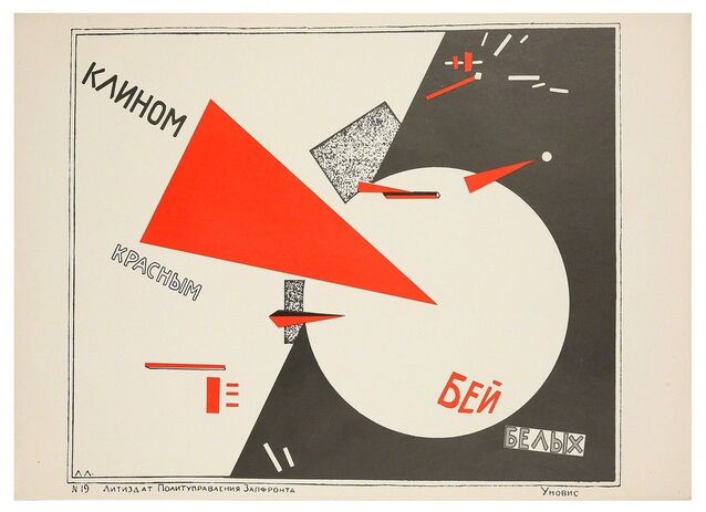
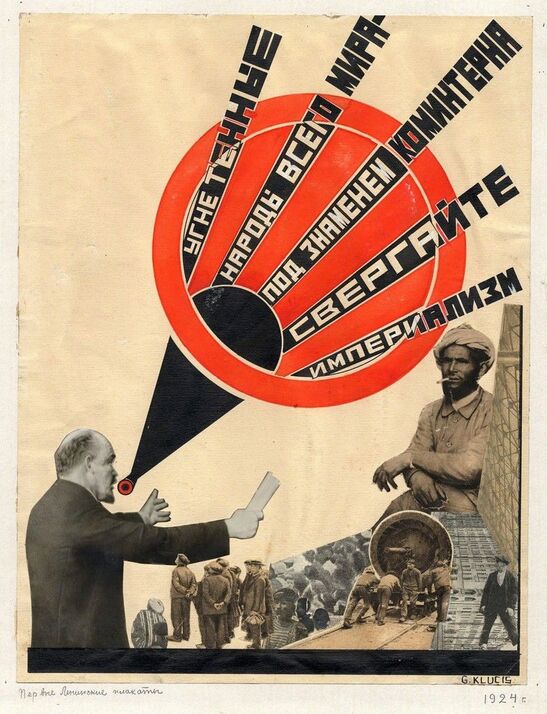
Constructivism was founded by Vladimir Tatlin and Alexander Rodchenko in Russian in the 1900's, and was based on the belief that art should directly reflect the modern industrial world. the movement took ideas from cubism, futurism and suprematism, but wanted to change the concern artists had with composition, and replace it with construction.
Picture
Picture
The first piece above is by the artist Gustav Klutsis, while the second piece is by El Lissitzky. one of the most striking difference is between these two pieces is that Lissitzky's work is very abstract in comparison to the piece by Klutsis. Their work uses simple shapes and text to convey its meaning, while Klutsis work uses collaged figures and objects. However he still uses some simples shapes within his composition. Another noticeable similarity between the two, is their use of colour, both use black and grey with a striking red. This bold red against the white and black really gives the posters power, and helps in capturing the eye of the viewer, which is definitely a must have when creating propaganda. only one of these two pieces uses photography and it is the one by Gustav Klutsis, who uses collaged photos of people, and I'm assuming the man with text coming from his mouth is supposed to someone spreading propaganda to there audience of collaged people. i think both pieces have circles as part of their composition as a way to keep the viewers eye travelling around the page, as a way to keep them focused on the poster, so they will read it.
0 Comments


Leave a Reply.

    Author

    I like mushrooms and frogs.

    Archives

    December 2020
    November 2020
    October 2020

    Categories

    All

    RSS Feed

Site powered by Weebly. Managed by 34SP.com
  • Home
  • Contact
  • University
    • Year 1 >
      • Semester 1 >
        • Art history
        • Introducing visual communication >
          • The comic
          • Technical skills
          • Drawing and visualising
          • Colour, composition, and linear narrative
      • Semester 2 & 3 >
        • Multi-dimensional Illustration >
          • 2D
          • 3D
          • 4D
        • Visual problem solving >
          • DIY alphabet
          • Type talk
          • Mini briefs
    • year 2 >
      • semester 1 >
        • Drawing >
          • Life Drawing
        • Illustrators toolkit
      • Semester 2 >
        • The Critical Illustrator
        • Illustration Projects >
          • Conceptual Editorial Illustration
          • Literal Illustration
          • Children's Book
          • Protest Pack
          • Anne Magill
    • Year 3 >
      • semester 1 >
        • Advanced Illustration >
          • Stamps
          • Book Jackets
          • Self Authorship
      • Semester 2 >
        • Final Major Project >
          • A Safe Haven
  • Portfolio