
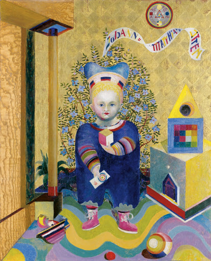
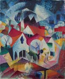
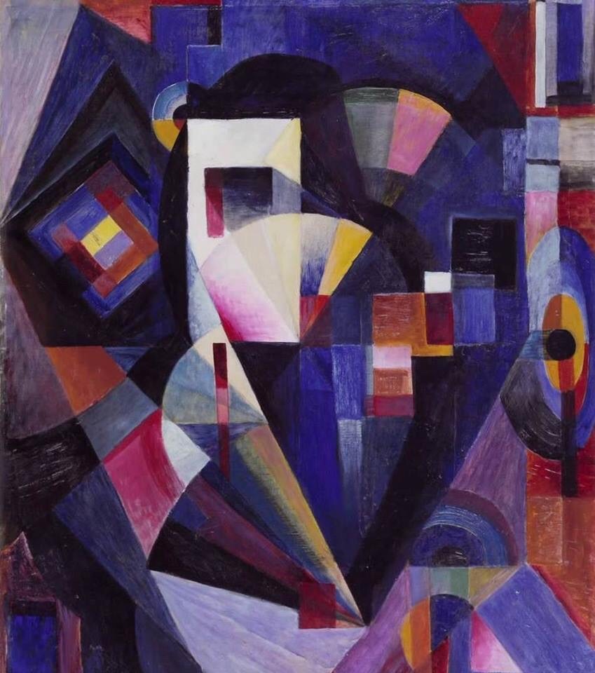
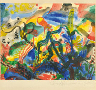
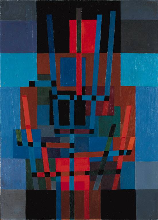
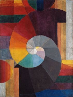
Johannes Itten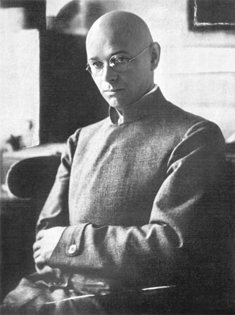 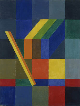 Johannes Itten was born on the 11th of November in 1888 in sudern-Linden in Switzerland. His father was a school teacher, so he was trained at a teacher training institute in Bern where he was trained to be a primary school teacher. only for a brief time did he teach, before spending a semester at the Geneva Ecole des Beaux-Arts in Genf and then taking a diploma in mathematics and science to teach secondary school. However, Johannes Itten eventually decided he'd be happier as a painter after travelling abroad, and ended up joining the first instructors at the Bauhaus in 1919. While teaching between 1919 and 1923 Itten developed a universal doctrine of design, which he taught as the preliminary course at the Bauhaus. He spent his time at the Bauhaus encouraging students explore their own feeling, and to experiment with colour, materials and form, instead of just copying the work of the old masters. The course emphasised three key elements; studies of natural forms and colours, the analysis of canonical artworks, and life drawing. Itten was classed as a pioneer of holistic art teaching and eventually went on to run his own art school in Berlin in 1926. The school trained painter, printmakers, photographers, and architects. While still teaching in 1932 at his own art school, he would teach in senior positions at renowned art academies. Towards the end of 1938, Itten became the director of the Museum of Arts and Crafts in Zurich and of the school affiliated with it.
0 Comments
Constructivism was founded by Vladimir Tatlin and Alexander Rodchenko in Russian in the 1900's, and was based on the belief that art should directly reflect the modern industrial world. the movement took ideas from cubism, futurism and suprematism, but wanted to change the concern artists had with composition, and replace it with construction. 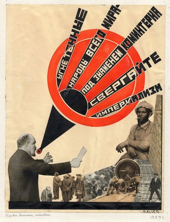 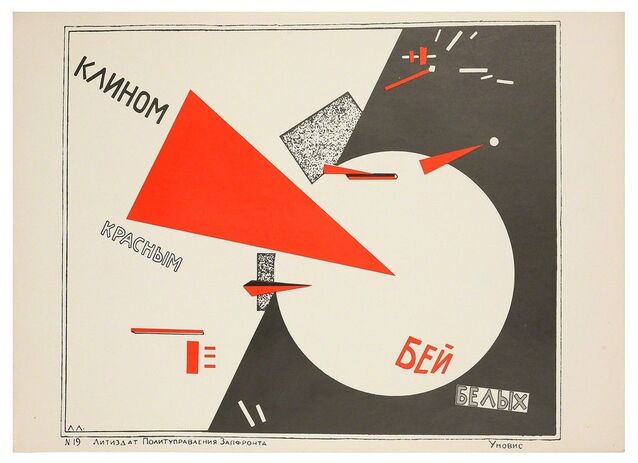 The first piece above is by the artist Gustav Klutsis, while the second piece is by El Lissitzky. one of the most striking difference is between these two pieces is that Lissitzky's work is very abstract in comparison to the piece by Klutsis. Their work uses simple shapes and text to convey its meaning, while Klutsis work uses collaged figures and objects. However he still uses some simples shapes within his composition. Another noticeable similarity between the two, is their use of colour, both use black and grey with a striking red. This bold red against the white and black really gives the posters power, and helps in capturing the eye of the viewer, which is definitely a must have when creating propaganda. only one of these two pieces uses photography and it is the one by Gustav Klutsis, who uses collaged photos of people, and I'm assuming the man with text coming from his mouth is supposed to someone spreading propaganda to there audience of collaged people. i think both pieces have circles as part of their composition as a way to keep the viewers eye travelling around the page, as a way to keep them focused on the poster, so they will read it.
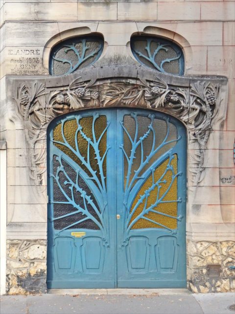
Art Nouveau was a decorative art style popular in Europe and north America in the late nineteenth and early twentieth centuries. The style is characterised by its use of flowing organic lines, and was used a lot in architecture, interior design, and illustration. Art Nouveau rejected traditional Victorian culture in an attempt to create a style free from clutter and historical imagery. As this new style spread throughout Europe and America it started to take on a distinctive appearance depending on where the work was from. Glasgow
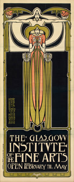
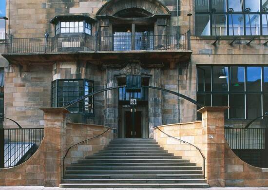
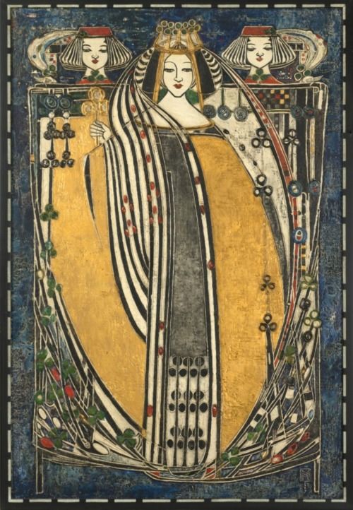
A unique type of Art Nouveau appeared in Scotland and was led by, Charles Rennie Mackintosh, his wife Margaret Macdonald, her sister Frances Macdonald, and her husband Herbert McNiar. This style was local to the city of Glasgow so once it gained prominence, it was eventually given the name Glasgow style. Together these four artists created a new style of Art Nouveau which was more geometric, restrained in ornamentation, and curving vertical lines. compared to the other three variations of this style, Glasgow style appears a lot more bleak, using darker, more industrial colours. however, even though these darker colours are used, you can see that they maintain the natural shapes and imagery within their work. Even the illustrations use these bleak, muted colours compared to the colour palettes used by the other three styles. Vienna
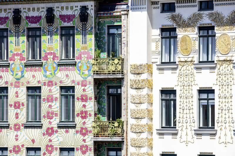
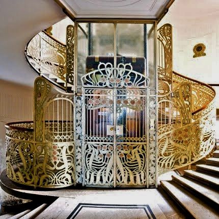
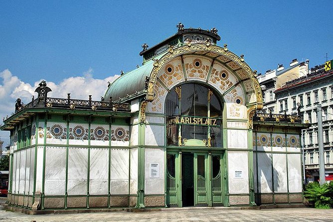
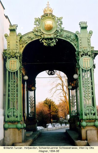
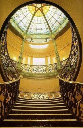
In Vienna architects of the Art Nouveau movement, Otto Wagner, and Adolf Loos, shaped its skyline as it is seen today. One notable similarity between each of these places has to be the used of plants, and especially flowers with illustrations, glass work and architecture. Even though all of these places use some form of plant or flower in their work, it is more noticeable in the work from Vienna, and Nancy. out of all the styles covered here this style has the lightest colour pallet, using a lot of white with pale green and gold accents. The gold used in their architecture stands out amongst the other styles, as every building has gold incorporated into, while the only other style that uses gold is the Glasgow style, which shows it briefly in illustrations. Madrid
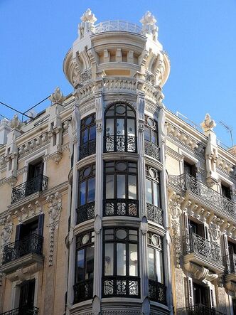
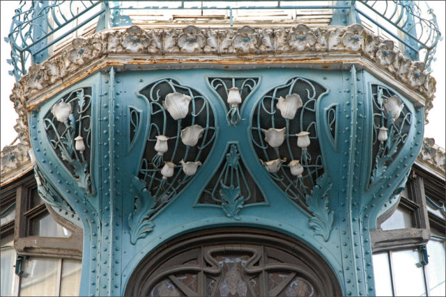
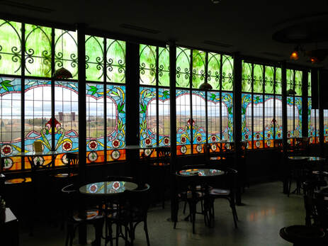 One similarity between the Art Nouveau style in Madrid and Vienna, is how grandiose the architecture is. They both have highly intricate details on their buildings, which also true for Nancy, but not to the same extent. This version of the style also uses dark wood with white or light coloured architecture. Nancy
Japan up until the 1850's was closed off from the west (besides the Dutch who could trade but only at one very specific port in the south of japan) so when trade resumed, the west became enamoured with Japanese art and design. This craze that blossomed in the late ninetieth century was given the name Japonisme by the French. Ukiyo-e woodblock prints had a huge influence on many western artists, and inspired elongated pictorial formats, asymmetrical compositions, and aerial perspective. Mary Cassatt
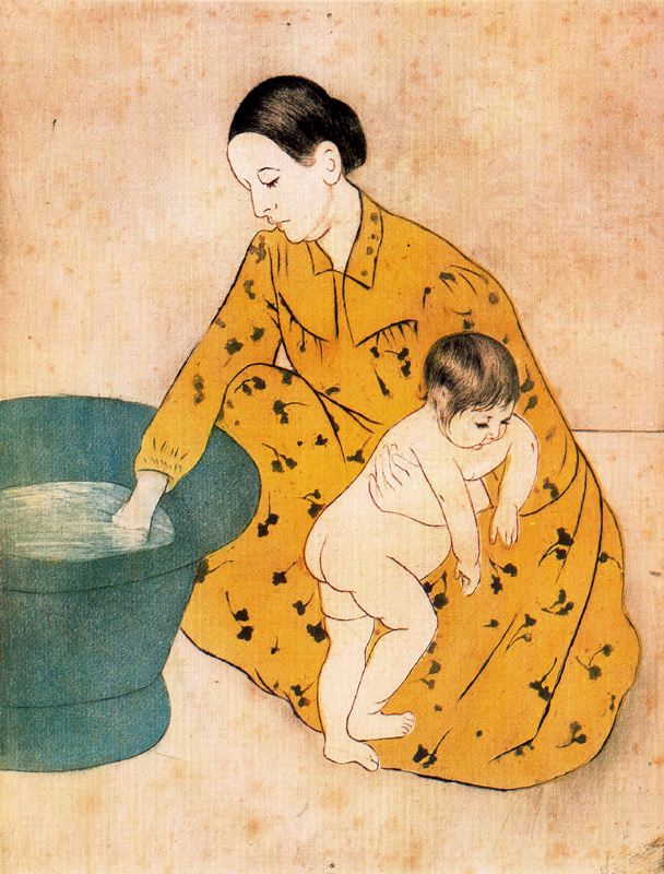
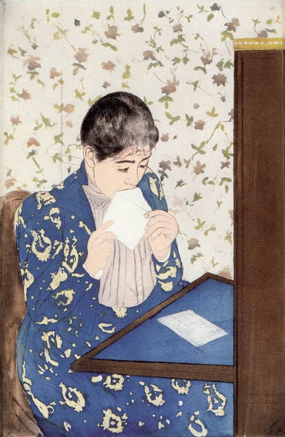 Mary Cassatt is an artist who you can see has clearly been influenced by the spread of Japanese art throughout the west. the paintings above and bellow are all done by Cassatt, however there styles differ. in the ones above you can see obvious Japanese influence, due to the amount of space left around the figures and the asymmetrical composition the art takes. while with the one below there is a lack of space within the painting; compared to the ones above it looks quite cluttered and full. the Japanese influenced paintings have far fewer details and are flat in comparison to the one below, which uses many colours to fill in the space and has noticeable brush strokes within the painting to give it dimension. the paintings above also have to combination of stylisation and realism mixed into them which a noticeable characteristic of Japanese art, unlike the painting below which takes on a more realistic approach, especially with the figure. 
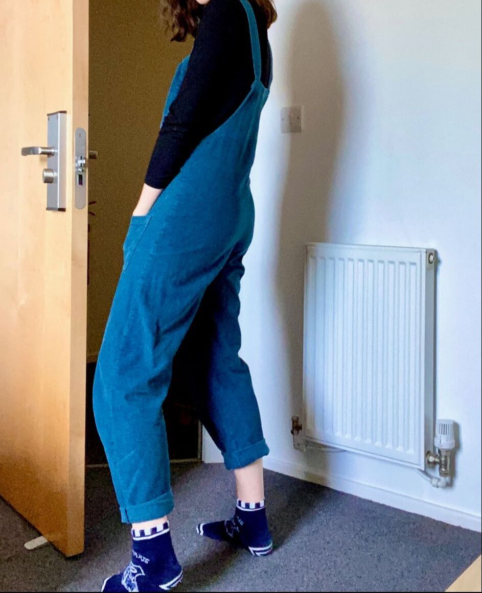
The word dungarees comes from the Hindi word 'dungri', the name of a village in India that produced the fabric used to make working clothes. In the 17th century when the English bought the fabric used in India they gave the word dungri an English twist, turning it into the word dungarees. This fabric was used to make trousers, and was only used to make overalls in 1853 after being designed by Levi Strauss. they were ideal for labour intensive jobs and quickly became popular among working class men. Lucy and Yak dungareesLucy and Yak is a small clothing company based in the south of England, and all of their clothes are handmade in India. Their goals are to make high end, good quality clothing, while ensuring that all their workers are paid a living wage and are in a safe working environment. They are also very invested in ensuring they are as environmentally friendly as they possibly can be, for example they are trying to make their dungarees out of recycled plastic bottles. This brand is a lot more ethical than most clothing brands, that just focus on abusing their power for cheap labour and more profit, and ultimately end up with poor quality products. The dungarees up above are corduroy and are made from a 100% cotton, and described a bottleneck blue. the straps are tied in knots at the front of the dungarees which allows the wearer to adjust them to the right size, and gives them a unique look which is something that I have personally only seen from this company. These dungarees are both comfortable and practical, they allow for a lot of movement which was the original reason for their conception. Dungarees originally would have been associated with the working class man, as they were a good choice for men working practical and demanding jobs. However, dungarees today are generally worn due to their comfort, and are generally associated with creative people such as painters and creatives in general, especially when they are brightly coloured.
|
AuthorI like mushrooms and frogs. Archives
December 2020
Categories |



 RSS Feed