
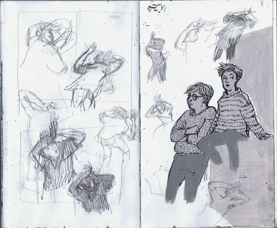
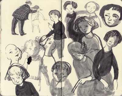
Evan KitsonEvan Kitson, compared to the other artists I have chosen, tends to go for a more realistic approach with his work. His focus appears to a lot more observational and figure orientated, as he has life drawing as well as still life drawing. From the very bottom drawing it seems like he uses his sketchbook to work out how to better draw anatomy, and figure out perspective by using a quick sketch and notes. Kitson's sketchbook work isn't too surprising when you look at his other work, all I'd say is it isn't as detailed but it is still quite detailed compared to other sketchbooks.  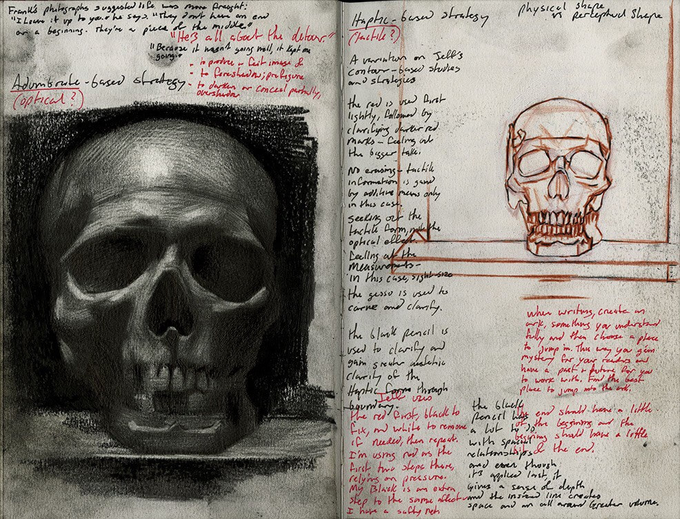 Pam SmyPam Smy's finished pieces use colour very sparingly, so it isn't a surprise that her sketchbooks have no colours, and instead varying shades to create tone. The focus of her work seems to mainly be on people and their expressions and how it relates to the figure. she does however focus some of her sketches on to inanimate objectives and environments, which is vital to her detailed illustrations as they don't just involve people. The skills she seems to be exercising is both character design and observational, as it looks like she is drawing someone's back garden in the very bottom picture. Smy's seems to use a few materials in their sketchbook, such as pencil, fine liner, an brush pen or marker, and possibly paint. These materials appear to be used separately to each other besides in one of the bottom drawings which seems to mix pen and paint.
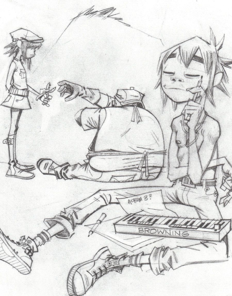
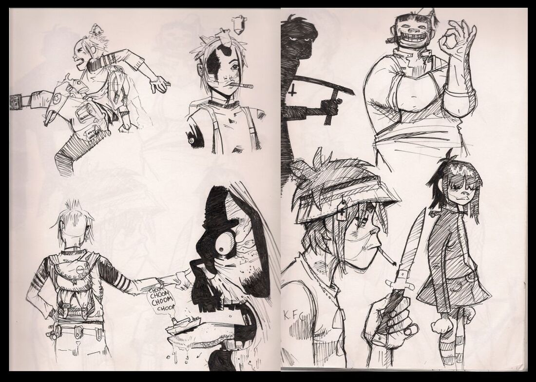
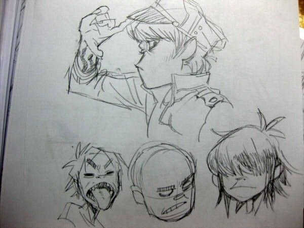
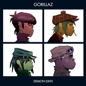
 Jamie HewlettJamie Hewlett's sketchbook seems to be used to practice figure, facial expressions and character designs, specifically the characters from the band Gorillaz. There is nothing too surprising, as his drawings show a lot of the detail you would expect from seeing his finale pieces, however his sketchbooks lack any of the vibrant and bold colours you normally see in his work. From the images I've seen of his sketchbooks the main subject of them has to be the characters from Gorillaz, which is understandable since he has been working with the band for many years now. You can see that the focus and time he put into his character designs has really helped him. If you look at his work from the album Demon days in 2005, and the work done for Humanz in 2017 you can see that his sketchbook work has paid off. Finally, it seems like Hewlett sticks with fine liner and pencil, which he sometimes uses to create texture in clothes or light and dark.
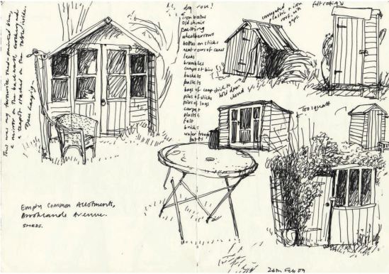
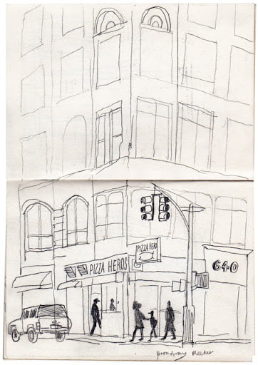
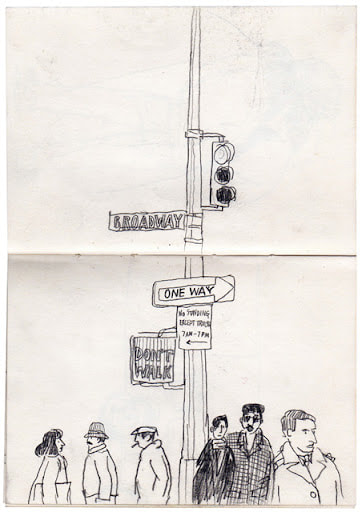
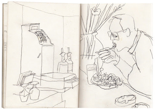
Lucinda RogersLucinda Rogers sketchbook work isn't what I was expecting compared to her finished works. When I was researching her I expected to find a lot more colour incorporated into her work, however a lot of her sketchbook work is void of colour. Rogers main focus in her sketchbooks seems to be line art and capturing a very simple idea of the urban environment, sometimes only focusing on certain aspects, such as people or buildings. From what I can tell she seems to work solely with fine liner, as the darker parts and scribbly but the ink is of a decent quality, so unlikely to be ball point.
0 Comments
Leave a Reply. |
AuthorWrite something about yourself. No need to be fancy, just an overview. Archives
November 2021
Categories |


 RSS Feed