a.lau.c Illustrations
  • Home
  • Contact
  • University
    • Year 1 >
      • Semester 1 >
        • Art history
        • Introducing visual communication >
          • The comic
          • Technical skills
          • Drawing and visualising
          • Colour, composition, and linear narrative
      • Semester 2 & 3 >
        • Multi-dimensional Illustration >
          • 2D
          • 3D
          • 4D
        • Visual problem solving >
          • DIY alphabet
          • Type talk
          • Mini briefs
    • year 2 >
      • semester 1 >
        • Drawing >
          • Life Drawing
        • Illustrators toolkit
      • Semester 2 >
        • The Critical Illustrator
        • Illustration Projects >
          • Conceptual Editorial Illustration
          • Literal Illustration
          • Children's Book
          • Protest Pack
          • Anne Magill
    • Year 3 >
      • semester 1 >
        • Advanced Illustration >
          • Stamps
          • Book Jackets
          • Self Authorship
      • Semester 2 >
        • Final Major Project >
          • A Safe Haven
  • Portfolio

Year 1 Illustration

Typography - DIY alphabet

2/12/2021

0 Comments


Font selfie 

Picture

Pottery

Initially I was considering a typeface made using flowers, however after finding smashed pottery on a walk, I decided to try using it to make a typeface. I do plan on exploring a type face with flowers , however this idea peaked my interest more so, I will work with this.
Picture
Picture
Picture
Picture
Picture
Picture
Picture
Picture
For the pottery I have two ideas on how I can utilise it. My first idea was to physically put the pottery into the shapes for the typeface. I started with the handles of what I'm guessing used to be teacups and tried forming a few letters from them. However, I was unsure of whether or not the handles could be used to make every letter in the alphabet, so decided to try the other pieces of smashed pottery to form the letters.
Picture
Picture
Picture
Picture
Picture
Picture
Picture
Picture
Picture
Picture
Using another handle from my pile of pottery I tried to see if it was possible to form previous letters that had failed. I do think it could be possible, but I would need more broken handles and specifically thinner handles in smaller pieces. I will try again if I'm successful in finding more broken handles, however I'm not sure if ill find more where I found the rest.
Picture
Picture
Picture
Picture
Picture
Picture
Picture

Pottery photoshoot 

After playing around with the other pieces of pottery, I have found that it is more flexible. this idea will allow me to produce the letters, numbers, and punctuation I need to fulfil this projects brief. I would still like to try the other idea, but for now I know I can rely on this idea.
Another idea that I had for the pottery was to take close up pictures of the pieces and then manipulate them using photoshop into the letters, numbers and punctuation. the only issue I've had with taking the photographs is getting the camera to focus when getting so up close to the pottery pieces. 
Picture
Picture
Picture
Picture
Picture
Picture
Picture
Picture
Picture
Picture
Picture
Picture
Picture
Picture
Picture
Picture
Picture
After messing around with some of the close up pieces and trying to find letters within the images, I decided that this idea wasn't the best. The photographs I collected are poor quality, as I don't have a camera that can focus as close up as I wanted to go, which means the letters range in quality, some worse than others. There was also the issue of trying to make each letter stand out so it is clear to the reader, but also maintain the texture of the pottery.

Shadow Photoshoot

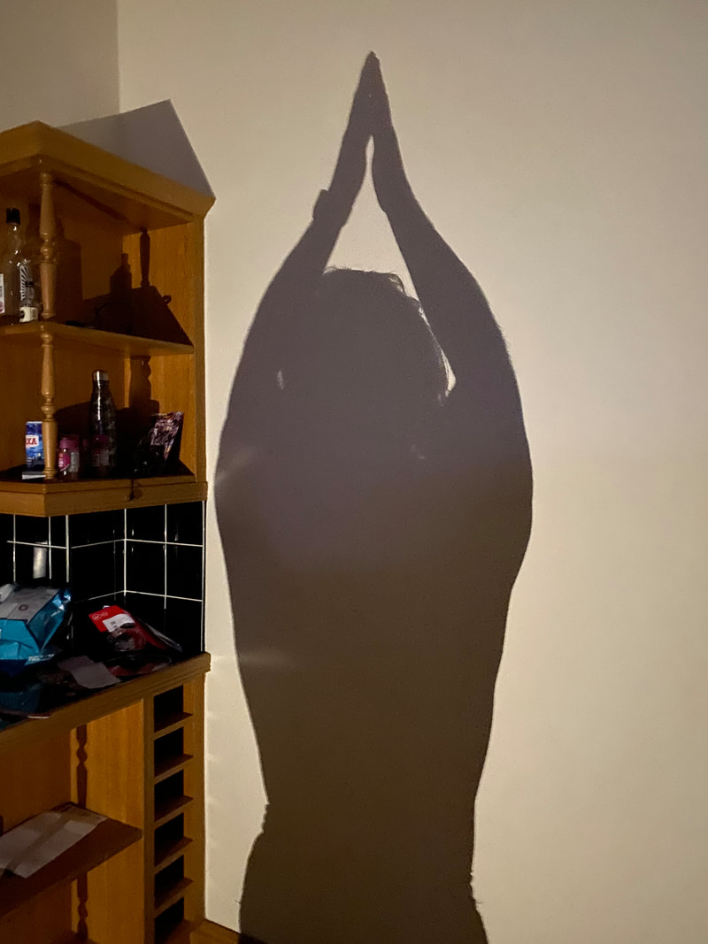
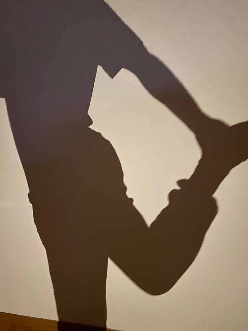
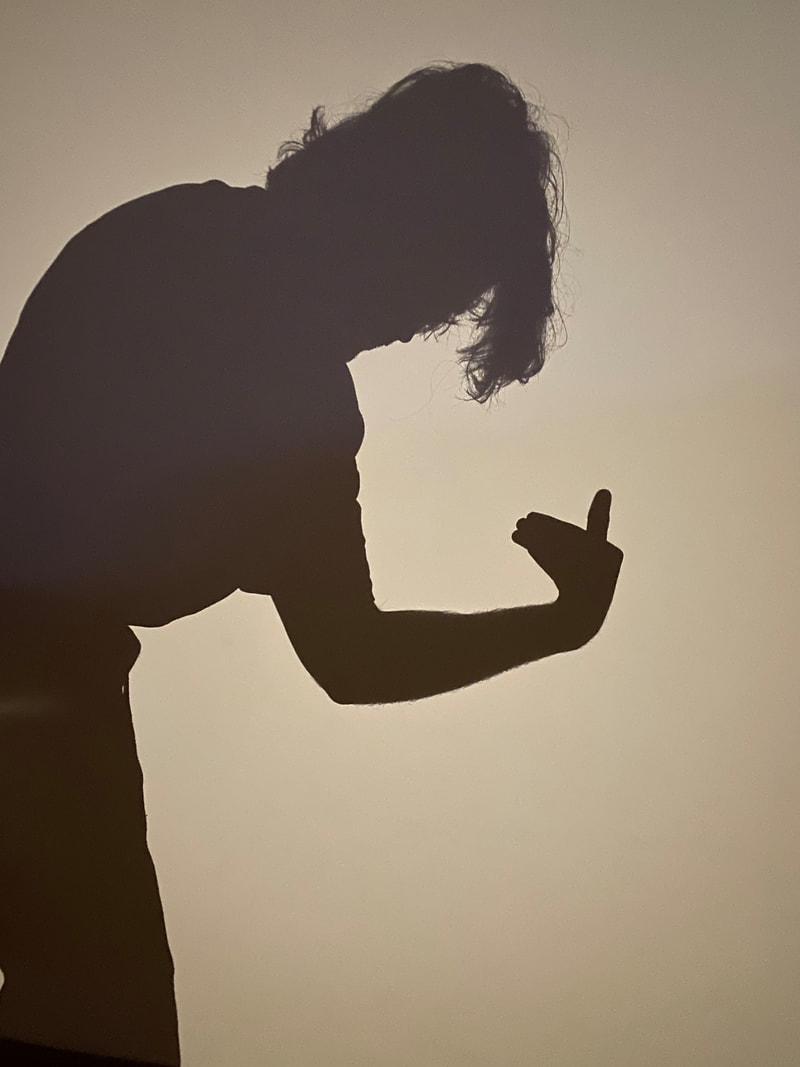
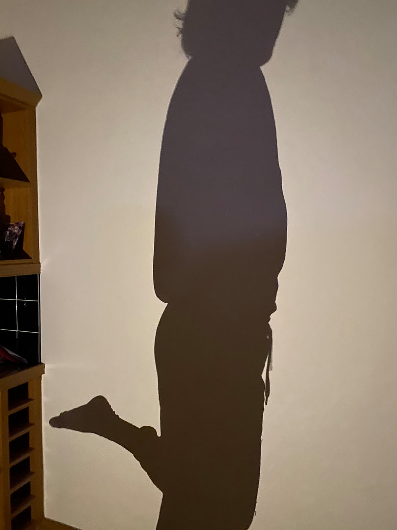
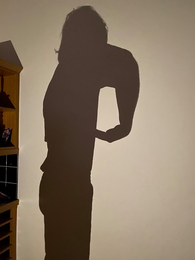
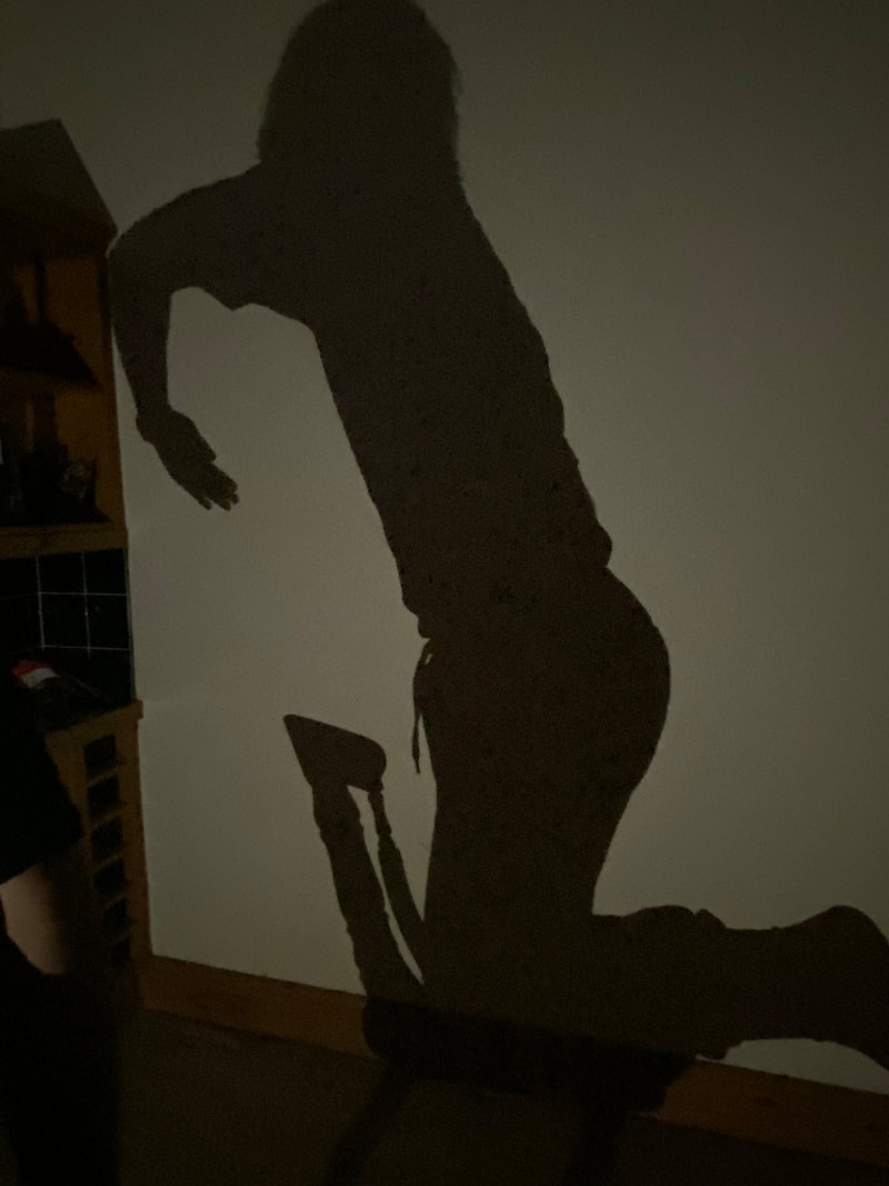
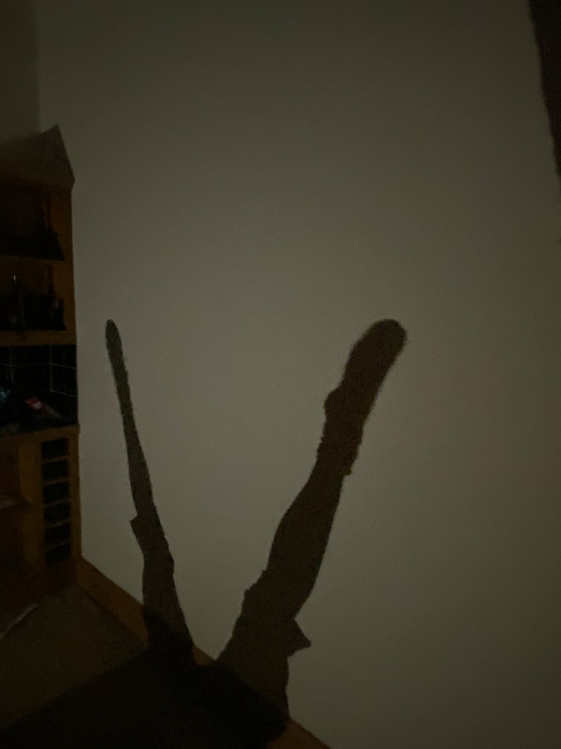
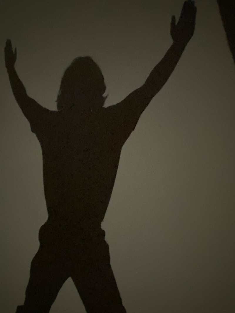
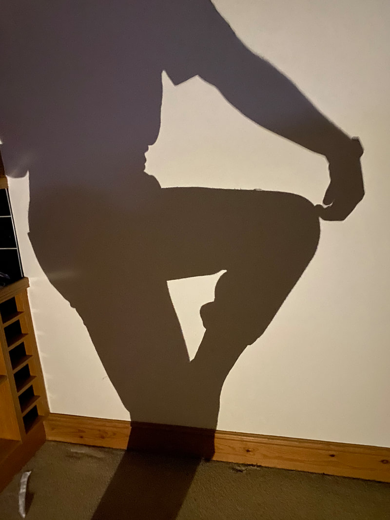
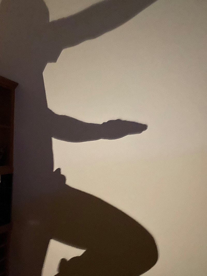
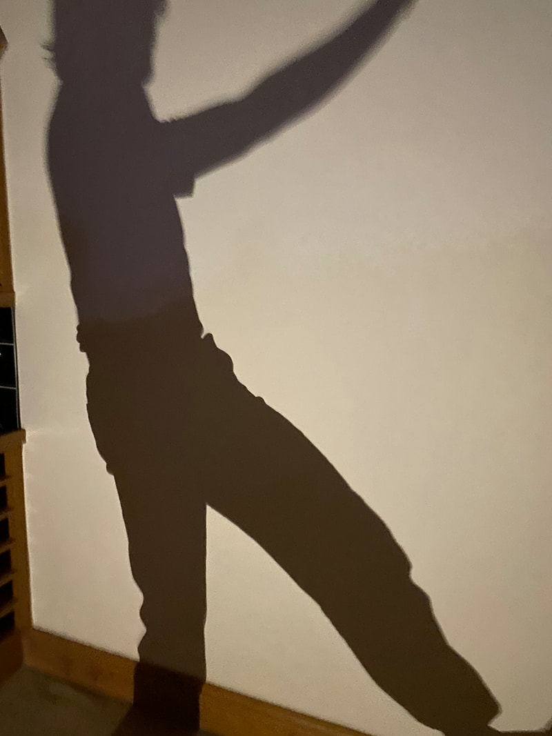
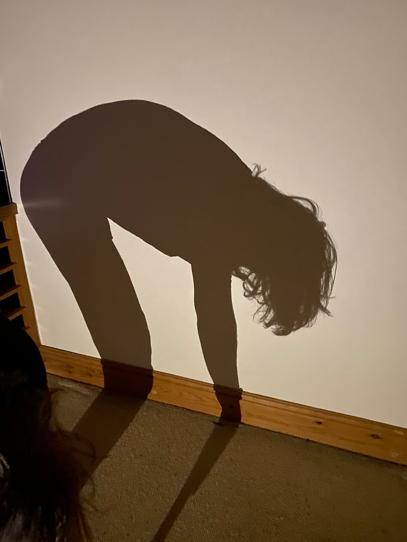
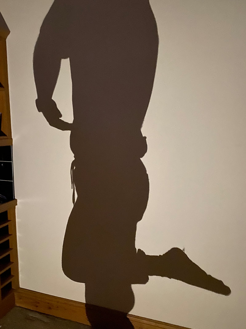
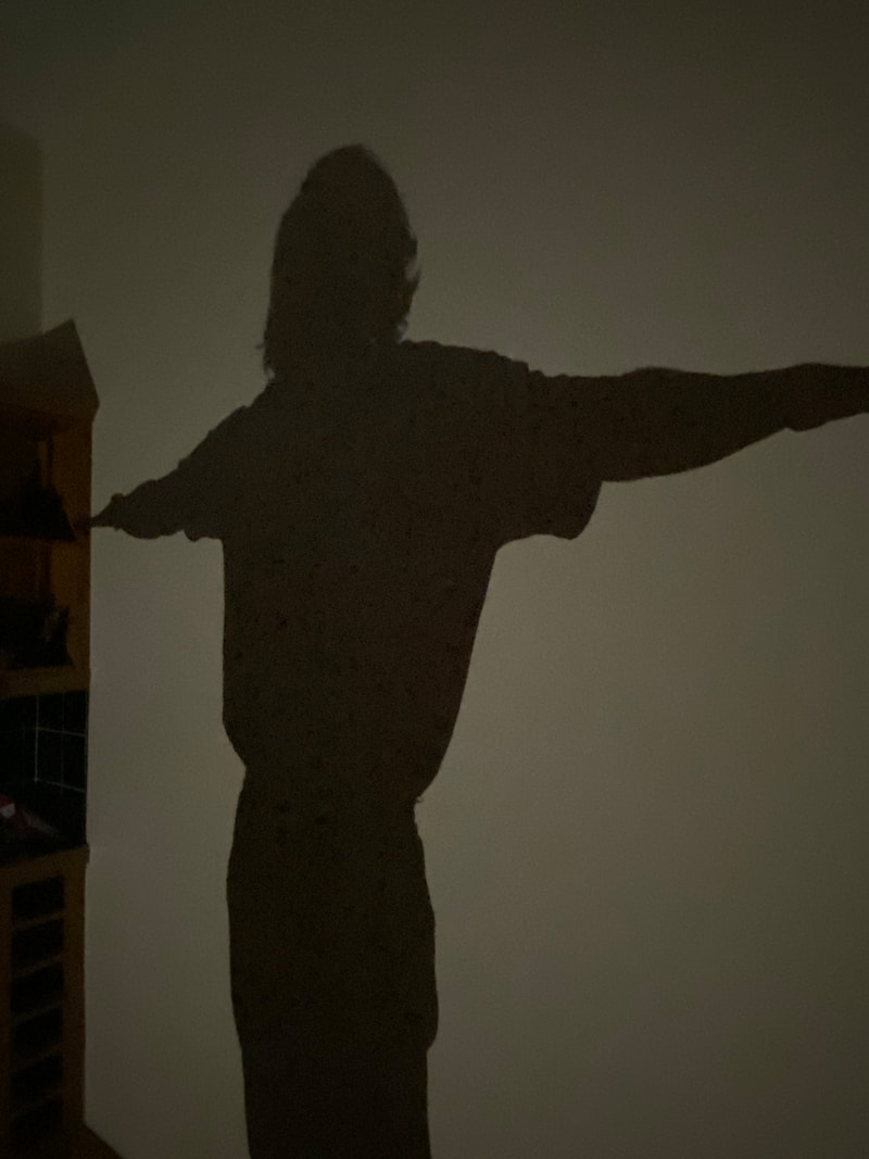
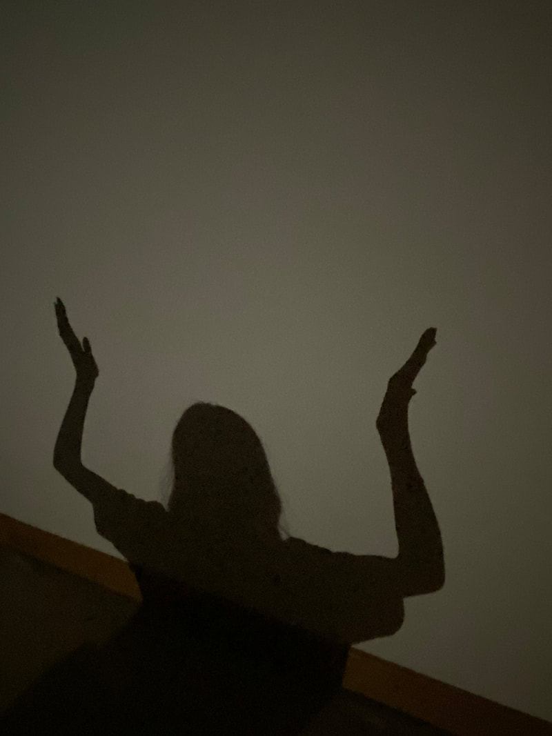
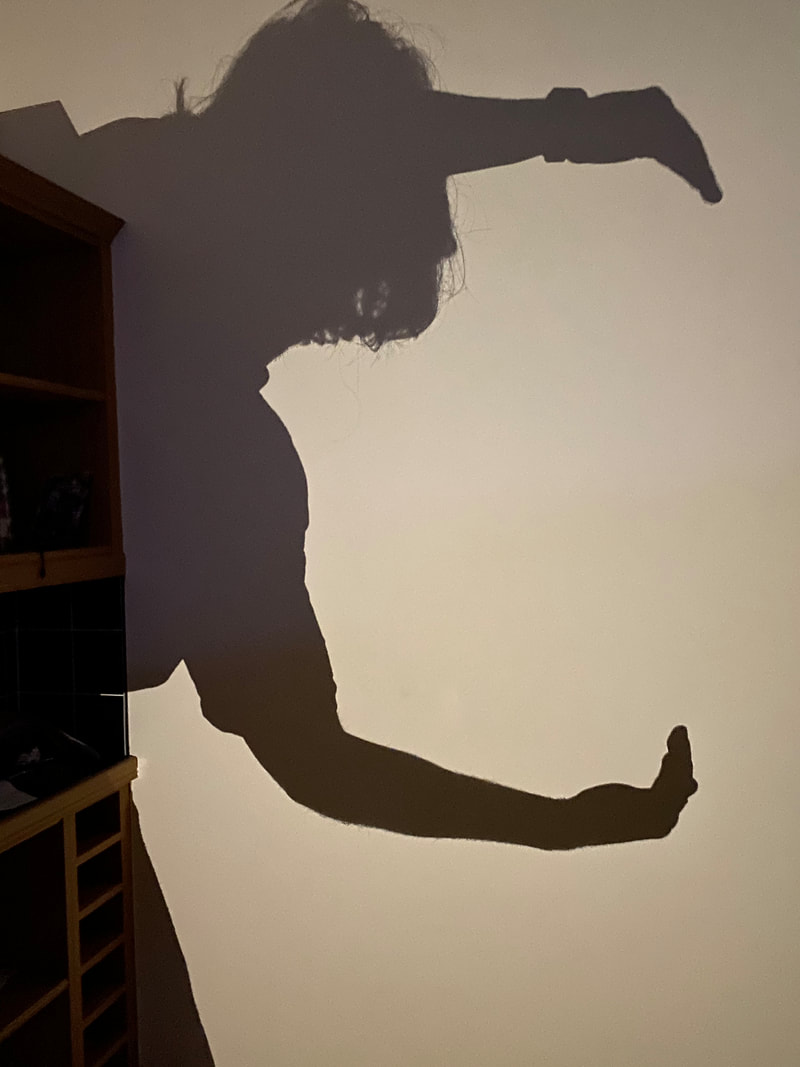
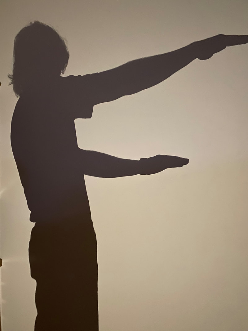
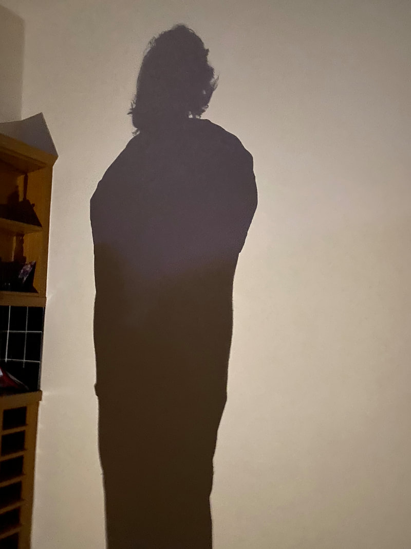
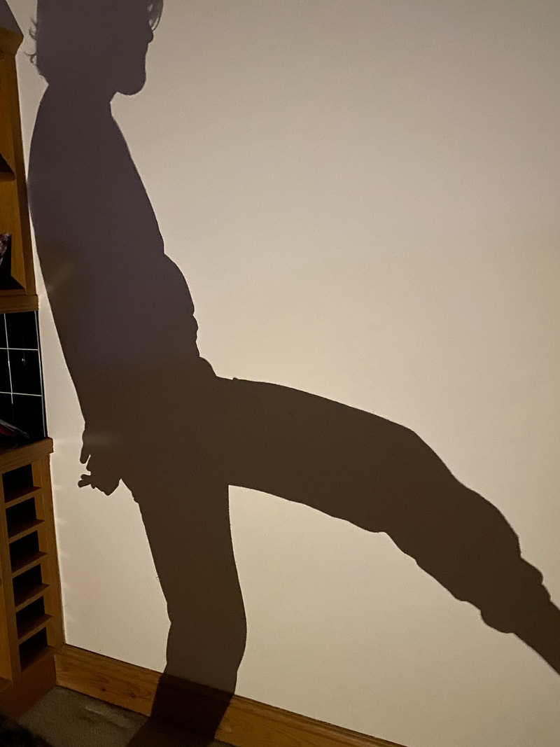
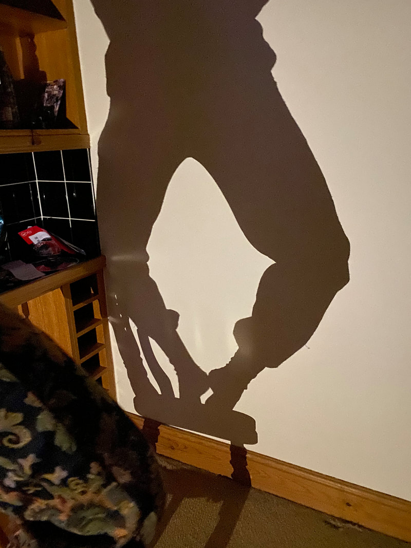
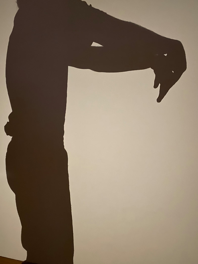
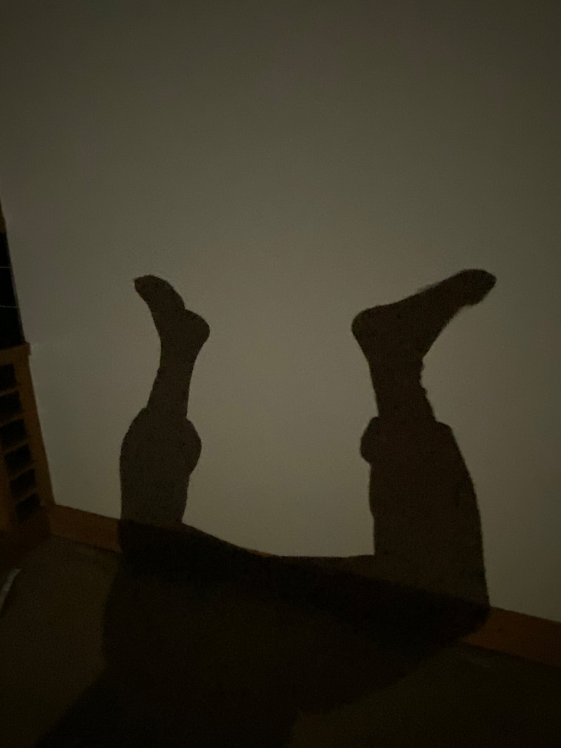
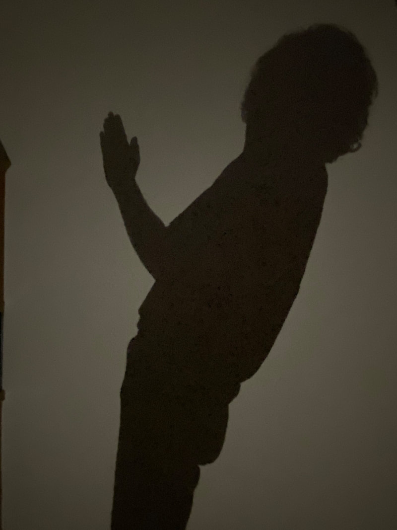
Another idea, completely different to the pottery, was using the figure and light to create shadows of the letters. There was some issues trying to get the right shape to make each letter obvious, for example not being able to contort the body into the right shape, or needing more than one person.
Picture
Picture
Picture
Picture
Picture
Picture
Picture
Picture
Picture
Picture
Picture
Picture
Picture
Picture
Picture
Picture
Picture
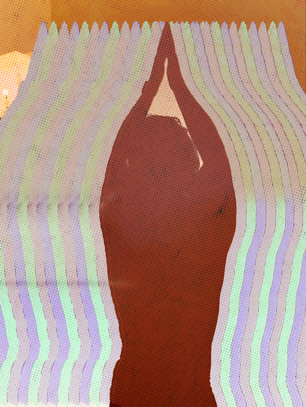
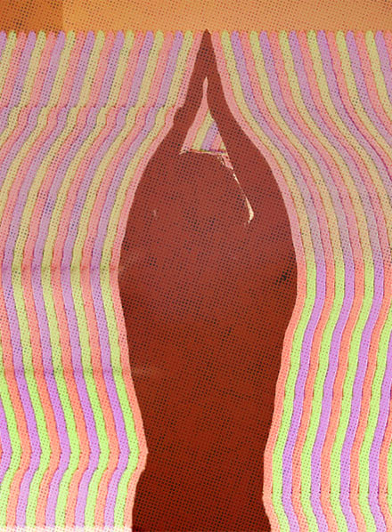
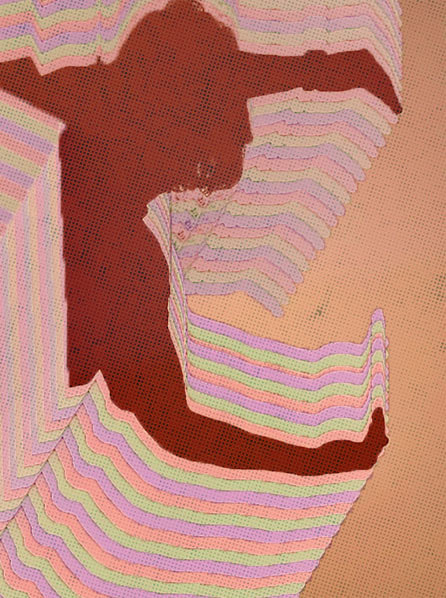
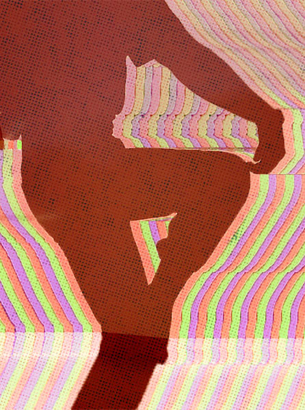
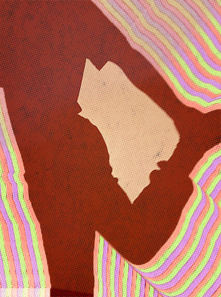
Once the photoshoot was over I went into photoshop with the images and started to play around with them. For the edits I had a psychedelic, retro idea planned , with my first attempt being on the right. After discussing with another student, they informed that the colours looked too washed out and i should increase the saturation, which I did with the images bellow. As well I also played around with the lines emanating from the figure, and whether or not I should leave parts of the background out. I like the look of this idea, however I don't know how well it would perform with the numbers and punctuation.
Picture
Picture
Picture
Picture
Picture
Picture
Picture
Picture
Picture
Picture
Picture
Picture
Picture
Since I liked the idea of the pottery with the shards and the handles, decide to combine the two. I think this was a good idea because the handles were very useful for creating the punctuation and the numbers, which might have been more difficult with just the shards alone.
Picture
Picture
Picture
Picture
Picture
Picture
Picture
0 Comments


Leave a Reply.

    Author

    Write something about yourself. No need to be fancy, just an overview.

    Archives

    April 2021
    March 2021
    February 2021
    December 2020
    November 2020
    October 2020

    Categories

    All

    RSS Feed

Site powered by Weebly. Managed by 34SP.com
  • Home
  • Contact
  • University
    • Year 1 >
      • Semester 1 >
        • Art history
        • Introducing visual communication >
          • The comic
          • Technical skills
          • Drawing and visualising
          • Colour, composition, and linear narrative
      • Semester 2 & 3 >
        • Multi-dimensional Illustration >
          • 2D
          • 3D
          • 4D
        • Visual problem solving >
          • DIY alphabet
          • Type talk
          • Mini briefs
    • year 2 >
      • semester 1 >
        • Drawing >
          • Life Drawing
        • Illustrators toolkit
      • Semester 2 >
        • The Critical Illustrator
        • Illustration Projects >
          • Conceptual Editorial Illustration
          • Literal Illustration
          • Children's Book
          • Protest Pack
          • Anne Magill
    • Year 3 >
      • semester 1 >
        • Advanced Illustration >
          • Stamps
          • Book Jackets
          • Self Authorship
      • Semester 2 >
        • Final Major Project >
          • A Safe Haven
  • Portfolio